Friday 11 January 2013

Print outcome - Invitation

For my print outcome I had chosen to do an invitation to the Wall Spring fashion show. As I previously mentioned, the typical style of Wall in terms of the website (www.wall-london.com) and customer newsletter, is quite simple and classic. I came up with a basic idea on Fotofix:


As you can see this is very simple, I used a plain white background layer, and then found a border image online. Using the eraser and the magic wand tool I removed most of the grey areas in and around the frame. I then added a text box and filled it, and then finally placed the logo layer, this logo already had a white background so I used the eraser on the selected layer to remove the white without effecting the black frame underneath.

When creating my final version in Illustrator I wanted to keep it quite classic but add some colour. I started by using grey and white tones but it didn't look effective enough. I then created colour version, I cannot show this image as it includes items from our new spring catalogue. I used a plain white background layer again and added a border using a preset border brush, by expanding the border I was then able to change the fill colour. I then added some text an image as well as of one of the spring models (with decreased opacity) in the background.

I decided that this version was not suitable, I did not think the colours were bold enough. I looked at some other fashion show invitation from Google:


Bot of the above images can be quite simply made using photographs, text and a logo. The first image is quite simple with a decorative border and a large title with the clients name, this again seemed slightly too basic looking. The next image looks very extravagant, it is fitting with the image of the model on the left. I like the style of this invitation, however, I wanted to match the style of the clothing that Wall is showcasing, so I did not want to be quite so bold but add more flair to my final print outcome. I wanted create something more eye catching, and decided that the pastel colours were not bold enough.

Fashion show trials

In addition to producing the Nature at Risk assessment; as required I also used the Adobe software to create the final outcomes for my portfolio. Again I initially used Fotofix to create a rough idea of what I wanted to produce:

 
Again I used a selection of layers, starting with an image of a catwalk in the background, and then individually adding each model by using the magic want tool to cut them out of their original background. As you can see in the above image, there is not a clean finish around each of the models, white specks can be seen. This could not easily be fixed using this software, whereas when using photoshop you are able to zoom into the pixels of the image and this enables you to edit and fix any white specks or colour discrepancies etc. 

Again, this image was a very helpful guideline for me when creating the final version in photoshop. It gave me a clear idea of how I wanted the layout of the image to be. When actually producing the image on photoshop I stuck to the design in some aspects, but as there are so many more editing options to choose from I was able to add other ideas into the final image, such as replacing the black background of the catwalk with an image of Kensington Roof Gardens, where my event is to be taking place. As my porfolio outcomes are based on a spring fashion show, I wanted to change the colour palette, and felt that the design of the above image was too dark, and needed to have a more fresh and spring like look. This is another reason why I changed the background of the catwalk. Also, the models used in the above image are not actually modelling the spring collection which is included in my portfolio. I was required to inform my boss, the founder of Wall London, that I would like to use images from the spring collection and was given permission to do so, however, I am not allowed to post any of my final images as they all feature clothing from the latest spring collection that has not yet been launched. This image is the final background I chose for my web outcome. 


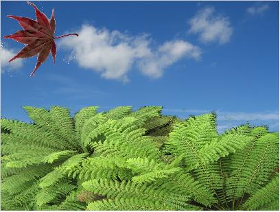
The colour palette of the clothing  includes light pastels and bright colours, such as blues, greens pinks and oranges; therefore I found this picture went well, and it also has more of a spring time feel to it unlike my trial picture which looks more wintry. This image is not as high quality as others I have found, although, I found that this looked the most natural and impressive when all the other layers had been added, although the images of the models were a very high quality, it created a nice effect and made the models stand out more. Another issue I had with this image was the sky colour. I felt that the sky looked too grey and did not suit the image, and tried various ways in Photoshop to remove and edit the sky. Firstly I found an image of a sky that I liked, and tried my favourite magic wand tool to select the sky without effecting the leaves. this worked fairly well in the centre of the image but around the leaves it left lost of white patches which made the image look untidy. I spent some time zoomed in, trying to edit each pixel, but I was not getting the desired effect. I then decided try to mask the image. I opened my sky image as the background layer and then placed the above image and made a copy (which was then hidden), in the first image I selected all the parts of the image that the original sky could not be seen through (so I avoided the top leaves on either side) using the magnetic selection tool and then cleaned up my selection using the quick selection tool, I then turned this selection into a mask using the mask button at the bottom of the layers panel. I was then able to unhide the copy of the same image and use the blending options to blend to the blue background without damaging the trees or making them look unusual. This technique worked very well and gave me the finish I desired and was very simple to do.

Nature at Risk - Adobe

Creating the final version of my Nature at Risk assessment using Adobe products was definitely much easier and gave me much more options in terms of editing seamlessly, adding effects and arranging images. Creating the final version in InDesign involved me working in all three softwares for different parts. As requested in the assessment criteria I had to create a logo for each page using Adobe Illustrator, and I also used Photoshop to edit the images provided to make them work and fit in my final outcome.


Creating this logo was actually a very simple process using Illustrator. I simply took the image provided and placed it in Illustrator, then did an Image Trace, which changed the leaf from looking like a photograph to looking more like a drawing. I used the 6 colour preset to create the background behind the leaf and then had to change the colours (which were originally on a grey scale) to green. I did this by expanding the image and individually changing the colour of each section. Changing the colour was a simple task, however, when zooming into the image I found that there were stray specks of white dotted around the background of the image. I then had to copy each colour code from the fill options and change each white speck to the relevant colour. This was the most time consuming part of making this logo, but apart from that, this effect can be achieved very easily.


I created the above image using Photoshop, it is very similar to the trial version I created in Fotofix, however, when using photoshop I was able to do more in terms of editing the look of this image. This was created using two layers, again with the tree bark as the background and then placing the nature image on top. In photoshop I was able to use the elliptical marquee tool to cut out a circle of the nature image. I made the selection using this tool and then selected the inverse and deleted the left over parts of the image (corners etc). I also used a feather when cutting the background of the nature image, which gave then edge of the circle a softer edge. 


This image was another test version of one of the pages of my document, I did this using Photoshop, although I did this in a very basic fashion, I wanted to test out using these tree branches in an image and getting a good finish around the leaves. I tried to use a masking tool and then blending the background. However, I did not feel that the final product was of a high enough quality, therefore I decided to use another image of leaves provided that had less of a jagged edge. Doing trial versions has been very useful and helped me to learn how to do new things within each software, as well as perfecting techniques that I already knew.

Nature at Risk

Before creating my final Nature at Risk document in InDesign, I created some test versions using the famous three Adobe softwares,, as well as using Fotofix, which I mentioned in other posts, which is a free online picture editor that uses layers to create an image. For this assessment, we had been given a selection of images to choose from to create a 3 page interactive document in InDesign. Before downloading the Adobe trials, I used Fotofix to create test versions of the layout of the pages of the document. The first test I did was not in keeping with the design criteria as it contained pictures from other sources, however I wanted to create this to see what I could do with Fotofix and how much detail and quality I could get from this software.


I then created another picture which this time was in line with the assessment criteria. Doing this gave me a basic idea of the design I wanted for the assessment, as you can see in the above image, I used a tree bark as my background layer and then placed a nature image in the centre to give it a border effect. I actually wanted to make the nature image rounded but I could not find the suitable tools to do so in this software.

Once I had downloaded the trials and spent more time using the Adobe products elsewhere, I was able to produce much higher quality images, and I was also able to edit and design them in more detail, as I had plenty more tools to make the most of.

Although I was not able to create the exact image that I was imagining, using Fotofix, certainly helped me in terms of considering the layout and what  images to chose and how they should be arranged on each page. When creating the final version using InDesign etc, I used these images as a basic outline of what I was trying to create.

Adobe trials

Since my last post, I have spent more time using Adobe Photoshop, Illustrator and InDesign. As I have now downloaded full trials of the softwares, I have developed a better understanding of how to use each of them and what they are best for.

Using Adobe illustrator is fairly similar to Photoshop, especially in terms of the interface. Comparing the use of pixels (photoshop) and vectors (illustrator) highlights the differences between the two. When using vectors with the brush or blob brush tool, it is easy to see that Illustrator gives the design created a much sharper finish. When drawing with pixels it does also give a fairly sharp finish, however when opening photoshop images in illustrator, the quality difference is clear to see. Photoshop is the best software to use for picture editing in my opinion, it has so many options and effects that can completely transform the look of an image.Illustrator seems to be the best for creating logo's and custom made background designs, it has the cleanest final image and is very useful in terms of being able to calculate the sizing of images and using mathematics to align and straighten images within the documents. This has allowed me to create a more equal and consistent looking outcome without 'going  by eye'

Using InDesign is very different to Photoshop and Illustrator, it has more detailed features involving transitions and hyperlinks, as well as being able to add interactive images and buttons which can link to other pages, locations and websites. To me, InDesign seems very useful for making web intended outcomes. It has so many web options which are relatively easy to apply, use and test. The buttons feature is one of my favourites, as it allows you to be creative with your interactivity, you can easily add different styles of buttons and choose what you would like the button to do when it is used in html or SWF.

I have been using these 3 softwares to create the outcomes for my final portfolio, as well as for my Nature at Risk assessment which I will be uploading. When using these softwares at Uni, we use the Apple Macs, which I have had trouble getting to grips with. However, as well as having the trials on my Windows computer, I have also had a chance to use the software on the Mac and compare how it is used on both. Personally, I find the softwares much easier to use on Windows, simply because it doesn't merge the interfaces the way it does on the Mac. It seems easier with Windows, to switch between softwares and have different images open in each at the same time. However, this is just because I am more used to working with Windows. Using the Mac could be seen as easier because it DOES merge the interfaces, at times it seems like you are not using separate softwares (when using photoshop and illustrator), which makes editing the same image in different softwares seem quicker and simpler.